Introduction: Typography and Its Role in High-Converting Emails
Typography plays a fundamental role in crafting visually appealing and high-converting emails. Not only does it contribute to the aesthetic appeal of your email, but it also significantly affects readability, comprehension, and user experience. That’s why understanding the influence of typography on email design is crucial for effective email marketing.
Indeed, typography can make or break your email conversions. The right typography encourages readers to engage with your content, while poor typography can discourage readers, making your content seem uninteresting or difficult to understand. Let’s dive into the world of typography and its impact on high-converting emails.
Understanding the Importance of Typography in Email Design:
Typography refers to the arrangement of text in a readable and aesthetically pleasing way. It’s an essential component of email design because it can affect how readers perceive your message. Clear, attractive typographs can boost engagement and conversion rates.
How Typography Affects Conversion Rates: Different fonts evoke different emotions and responses from readers. Using the right fonts can make your email more compelling and persuasive, thereby increasing your chances of converting readers into customers.
The Basics of Typography in Email Design
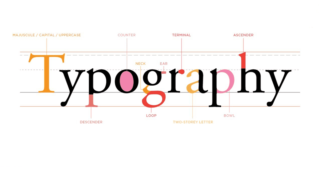
Before delving into the intricacies of typography for high-converting emails, it’s necessary to understand the basics. Typography isn’t just about choosing a stylish font—it encompasses several other elements that work together to create a cohesive and effective design.
Key Elements of Typography: The primary elements of typography include the font, size, line height, letter spacing, and color. Each of these elements contributes to the overall readability and aesthetic appeal of your emails.
Understanding Different Types of Fonts: Fonts come in various styles, each with its unique characteristics and implications. Serif fonts, for instance, convey tradition and reliability, while sans serif fonts are modern and clean. Script fonts can evoke elegance, while display fonts are ideal for making a strong visual impact.
Selecting the Right Font for Your Email
Choosing the right font for your emails is critical. Your font choice should reflect your brand’s personality and the message you’re trying to convey. It also needs to be legible and visually pleasing to ensure a positive user experience.
Tips for Selecting the Right Font: Start by considering your brand and the purpose of your email. Are you aiming for a professional tone, or is it more casual? Do you want to convey trust and authority, or creativity and friendliness? Answering these questions can help you choose a font that resonates with your audience and enhances your message.
Examples of Effective Fonts in Email Design: Certain fonts tend to work well in email design due to their versatility and readability. Examples include Arial, Helvetica, Georgia, and Verdana. However, the best font for your email will depend on your specific needs and brand identity.
The Art of Font Pairing in Email Design
Font pairing—using more than one font in a design—is a powerful technique in email design. The right font pair can create harmony, contrast, and visual interest, making your emails more engaging and effective.
Creating Harmony and Contrast: The key to successful font pairing is achieving a balance between harmony and contrast. You want your fonts to complement each other without being too similar. A common approach is pairing a serif font with a sans serif font, combining tradition and modernity in a visually appealing way.
Best Practices for Font Pairing: When pairing fonts, consider factors like the x-height, character width, and weight. Fonts with similar proportions tend to pair well. Additionally, limit your design to two or three fonts to avoid overwhelming your readers.
Size and Hierarchy in Typographs
Font size is another crucial aspect of typograph. By manipulating font size, you can establish a visual hierarchy in your emails, guiding your readers through your content in a logical and intuitive manner.
The Role of Font Size in Visual Hierarchy: In email design, larger text typically signifies higher importance. Headers are usually the largest, followed by subheaders, main text, and fine print. This hierarchy helps readers understand the structure of your content, making it easier for them to digest.
Choosing the Right Font Size: There’s no one-size-fits-all answer to the ideal font size—it largely depends on your audience, the device they’re using, and the nature of your email. However, a general rule of thumb is to keep your main body text between 14 and 16 points for optimal readability.
The Impact of Color and Contrast in Typography
Color and contrast can greatly enhance the effectiveness of your typography. They can draw attention to key elements, improve readability, and evoke specific emotions or responses from your readers.
Using Color and Contrast to Enhance Readability: High contrast between your text and background can make your text easier to read, while a carefully chosen color can highlight important information or calls to action. Be mindful of color theory and aim for a pleasing, harmonious color scheme that aligns with your brand.
Tips for Selecting Colors: The colors you choose should reflect your brand and the tone of your message. Additionally, make sure your text is legible against its background—light text on a dark background or vice versa generally works well.
Testing Your Typography for Maximum Conversion
Testing is a critical part of email design. It’s the only way to truly know what works for your audience and how you can improve. This applies to typography as well—everything from your font choice to size to color should be tested and optimized.
The Importance of A/B Testing: A/B testing allows you to compare two versions of your email to see which performs better. You might test different fonts, font sizes, or color schemes, and then use the results to inform your future designs.
Tools for Testing Typography: Several tools are available to help you test your typography, such as Google Fonts, Font Pair, and various email marketing platforms that offer built-in A/B testing features. Use these resources to refine your typography and maximize your conversions.
Conclusion: The Power of Typography in Email Conversions
Typography is a powerful tool in crafting high-converting emails. It affects how your readers perceive your message, how easily they can read and understand your content, and ultimately, whether they engage with your call to action. So, keep experimenting with different fonts, sizes, colors, and layouts until you find what works best for your audience and your brand. Remember, the right typography can make all the difference in your email conversions. Start giving typography the attention it deserves in your email design process today.
You’re now equipped with a wealth of knowledge on typography in email design. It’s time to apply these insights and watch your email conversions soar. Get started now—your potential customers are waiting!